 |
| Laser cut skyline of New York that was scanned into the computer. This will be brought into photoshop to style it like the London skyline with layers. |
 |
| First attempt at the New York themed Fashion poster. Skyline needs to take up the majority of the page. Will make it larger and add colours. |


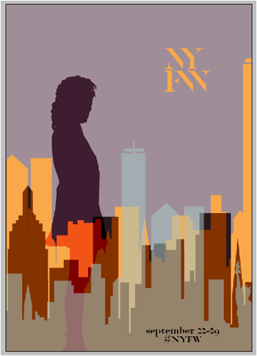
Two different colour variants for the NYFW poster. I used a silhouette figure from the internet just to see where the placement of my own could work. Filling the sky space with the lettering of the location was a test. It wasn't as effective as the London versions and so this idea was dismissed.
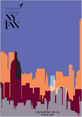

Trying to decide on the NYFW logo. Typeface from the official website was used. The inclusion of the sponsor was removed after alternating between colours, as it distracted the viewer from the main information and the LFW poster did not include the sponsor either. Often there are many sponsors too so that made it difficult to choose one for the poster.


Above shows some decisions made for choosing the colours. The LFW poster does not include any black in it and I wanted to avoid using black in the NYFW poster too. The sponsor was removed from the text.


Once happy with the silhouette colour I worked on the type colour. I found this poster harder to get the colours right because I had used shades taken from my sketchbook research of new York and its iconic buildings.

Below are four alterations to the poster. You can see that besides the colour changes and silhouette, I have increased the size and hieght of the skyline. To ensure the poster worked with London as a set I compared them together.


I chose the 3rd comparison because the colours are from the same palette although different shades. I feel that this allows them to work together but gives them enough difference so they are distinguishable from each other. The London poster gets a different silhouette too.
No comments:
Post a Comment