Research and Experimenting:
used key words that I associate with London, such as Union Jack, the Queen and London Fashion Week (as this is the subject matter for the poster) to get a brief background knowledge on fashion illustrations and fashion in general associated with the two chosen fashion weeks as I had no prior knowledge of them, or fashion.


Experimenting:


Wanted to use paper cutting as it not always a common practice used in the 21st century. often things are made with the aid of a laser cutter. Also wanted to see if my hand and wrist injury had improved to comfortably create something using a craft knife.
tried out different materials underneath the paper. The most visually appealing is the last image above with the white and grey faux fur. The other two images don't show enough of the texture of the material and the one on the top right is just a dull brown carpet so regardless I found that image less appealing and interesting.
Tried paper quilling too. This took up too much time and so this was abandoned. In hindsight now as I write this, I could have explored this idea further but at the time I was conscious of the time restraints and the fact I had to make two posters.
More Research:
Before I made a start on my paper quill I did some research into quilled lettering as well digital quilled pieces too.
http://www.allthingspaper.net/2011/10/quilled-card-and-digital-quilling.html - traditional and digital quilling.
http://www.allthingspaper.net/2011/09/digital-quilling.html - digitally quilled.
https://www.behance.net/sabeenu - paper quilled typography by Sabeena Karnik.
https://www.artyulia.co.uk/ - Yulia Brodskaya is paper quilling artist who I have admired for a few years now and has provided me with much of my inspiration for the craft of quilling.

https://www.pinterest.com/sazzaya/paper/ - my pinterest board that includes both paper cut and quilled work by others.


Skylines have had an appeal to me throughout my life, possibly due to my lack of experience in a city location or it could be because I often get drawn in by the skyline scenes that have limited detail and colour often within silhouettes.


Tried the skyline scene with the London fashion week paper cut. Didn't work out as well as I had hoped because the skyline needed to be further away from the text cut out. Due to the cheap flimsy paper and no one around at home to help hold the paper I struggled to try and achieve this myself. I didn't like the final out come that I did get. I wanted more detail of the skyline visible.

After this I hit a creative block. I then moved onto the book cover. It wasn't until after the London college trip that I went back to complete this poster brief.
I chose the poster brief because I feel like I avoid posters and I often struggle with choosing the correct typefaces and so I felt I should push myself to be out of my comfort zone.

Further Research:
Hat Designers:
http://www.vogue.co.uk/shows/autumn-winter-2015-ready-to-wear/ziad-ghanem/
http://www.localspotter.com/interviews/london/570-cult-couturier-ziad-ghanem#.WH-jN-aLSUn
- Ziad Ghanem, haute couture designer.
http://www.localspotter.com/interviews/london/570-cult-couturier-ziad-ghanem#.WH-jN-aLSUn
- Ziad Ghanem, haute couture designer.
http://www.sofeminine.co.uk/fashion-accessories/hats-d23952.html - top 10 hat designers in the UK.
http://philiptreacy.co.uk/collection/aw16 & http://philiptreacy.co.uk/studio - Philip Treacys hat designs and bio link.

I used this image later on in the project to overly the shard into the hat shape.
Fashion Illustration:
http://jason-brooks.com/ - Primarily looked at the fashion, illustration and lifestyle sections of his portfolio. I found his work visually appealing because of his use with vector shapes and silhouettes.


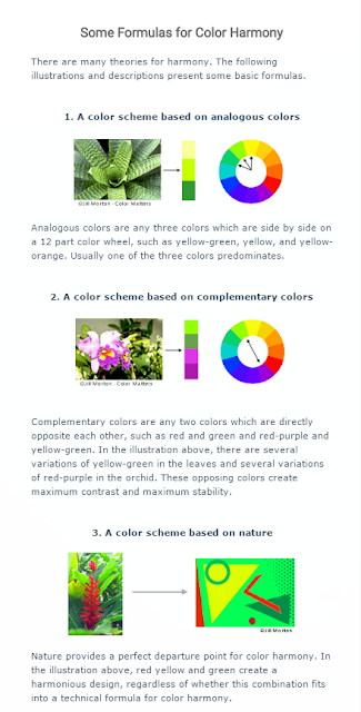


Colour Theory:
http://www.sensationalcolor.com/understanding-color/theory/color-relationships-creating-color-harmony-1849#.WHNi1FOLRaQ - this was my main source for understanding colour harmonies.
Below are some other images that explained it to me when I did a google image search.


https://www.pinterest.com/sazzaya/poster-project/ - My pinterest board I made whilst looking up examples of posters for the fashion weeks.

No comments:
Post a Comment