 |
| Figure 1 |
 |
| Figure 2 |
 |
| Figure 3 |
 |
| Figure 4 |
 |
| Figure 5 |
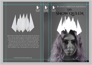
Screenshots from the book cover, in Photoshop, showing some of the different typefaces considered (figures 1-5)
The white text blends too much into the crown and gets washed out as your eye doesn't know where to focus.
 |
| Figure 6 |
 |
| Figure 7 |
 |
| Figure 8 |
 |
| Figure 9 |
 |
| Figure 10 |
 |
| Figure 11 |
Figures 9-11 show the first final covers. The last cover in figure 11 is the most dramatic because of the high contract between dark and light. The main focus of the cover is based on the crown. In the group critiques it was suggested to change the back cover image, remove the image on the spine, make the text stand out more as it is hard to read on the front cover.
 |
| Figure 12 |
Colours were reconsidered. The contrast between the background and crown is still desired for the overall feel of the book, dark and cold. The crown is meant to signify power, control, ice and the mirror that features at the start of the book. To get this feeling across the images were altered further, as well as cropping the face so the crown took up more of the front page.
Image from the photoshoot of the ice crowns was used on the back cover to (see photoshoot post for more images)
 |
| Figure 13 |
Went back to using white text on all of the book as the background was changed to black. At first it was black because it was easier to work with and then the idea was to change it to the blue but after all the alterations the dramatic, dark nature of the original story fitted with this styling.
Figures 13 and 12 show the differences in the covers. Biggest changes are with the two crown images, points were transformed in Photoshop cs3 to make them more pointy and sharp looking to give the appearance of "do not touch" the publisher was changed to Bloomsbury instead of Walker books because of two reasons;
Figures 13 and 12 show the differences in the covers. Biggest changes are with the two crown images, points were transformed in Photoshop cs3 to make them more pointy and sharp looking to give the appearance of "do not touch" the publisher was changed to Bloomsbury instead of Walker books because of two reasons;
1. Walker books is based on children's books and the audience for this cover was not intended for children as the stories would be close to original as possible. Aimed for young adults or as a collectors item.
2. When on the London trip with college we got to visit Bloomsbury and so I was more familiar with this publisher than many others out there.
Above are the two GIFs made for this book cover. Second GIF has SFM DESIGNS included so I could add it to my Facebook page SFM Designs. The final GIF is actually the first above.
Alterations to be made would include;
Have more snow, have it float down more like a leaf (side to side more)
Have the text fall in a jumble and at the crown have 'coming soon' clearly stand out from the crown by using a different colour.
Maybe apply a glow of another colour to the snowflakes to make them stand out on the crown more as they get lost more.
Make the snowflake changes more smooth, they jolt a bit but this is because I was trying to stick to my deadline for the work and I was unfamiliar with the GIF process and layering using Photoshop.
Issues I had:
- Ran out of time.
- Poor time management.
- At the end of this brief I was more invested in this and trying to perfect the GIF as it was similar to a stop motion and trying to make everything move smoothly, however I had to stop and move onto my next project.
- Struggled to choose appropriate text-ideally I want to make my own however time constraints made me reluctant to try and digitally produce them as I was also unfamiliar with the software (such as adobe illustrator)
End Thoughts:
- I feel like the London college trip is what has made me a week behind the schedules although I realise that I need to work on improving my time management skills; specifically recognise when and where is best for me to work and how to motivate myself to get the job done.
- Enjoyed making the GIF. Would like to make another using Photoshop as I feel more confident using it now.


No comments:
Post a Comment