Research on the union jack and quick outcomes that I came up with from it. I quite liked the figures in the second image, the one on the right is more appealing, possibly because you can make out more of her face and some more of the flag detail.
Both are rather abstract in appearance though.


Among my research I also looked at the Queens hats and outfits. I wasn't aware of how vibrant some of her outfits were or how interesting the hats could be. I decided that combining a hat within a skyline could work and so instead if using my own shots of the shard (because they had glare from the windows and the quality wasn't the best either) I found an image online and used a British designers photograph of a hat they had designed just to see if the idea could work. I liked the outcome but I would have to use my own photographs and so I dismissed this idea as the images I had were just from my phone and most skyline shots I did have were taken from inside and thus had a reflective glare on the window.


I scanned in my original paper cut. I also laser cut a different skyline in case I wanted to use a different skyline instead (the aim was to use my original cutting though) When in London I found this print in two if the museum gift shops that we went inside. I liked the style of it and was curious to see if I could digitally produce something like it.
 |
| Before altering the layers to make them smooth |
 |
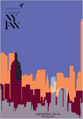
| Added a different blending option o the skyline layers to try get a screen print styling. |
 |
| Alternating around with colours. this one and the one above reminds me of the font used on a gin bottle when it has been embossed. I think of Gordon's gin but I was unable to find a photograph to show what I mean. |

 |
| Went back to the original idea I had of the gin bottle stretched text. I visually found it appealing but I felt that it gave the viewer too much to look at and made the whole scene too busy. |
 |
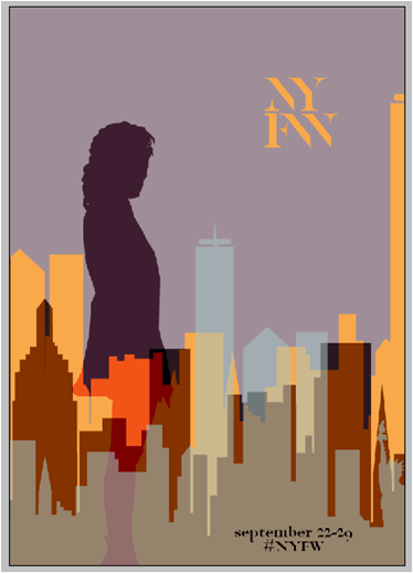
| The figure in this was used just to see if the idea of adding in a figure helped to give the whole poster scene a more fashion based feel. it did and made the whole thing more aesthetically pleasing however, I need to use my own image. |
 |
| I used photographs taken from the London college trip that I had taken at one of the museums. Getting the correct colours was difficult as i was then applying a blending modifier to get the screen print effect so you could see the skyline behind. after comparing the two posters together, i decided that the silhouette for London needed to change too so i used the same collection of my work and photoshopped the figure onto my scene. |


I had originally gone to use the figure above in pink, however I made the mistake of trusting a computer to sleep so I could go back to editing after a shift at work. This led to me loosing about 2hours worth of editing. I then went with the purple figure and spliced part of the yellow one to get a large enough body.