Brief 3
aim: to visualise a space using blender to demonstrate an understanding of brand and identity.
I chose blender because i am more familiar with it. I had originally wanted to render the scene within Unreal Engine however, given the short amount of time i had allocated myself for this project, I had to be conscious of my own skills.
This brief came around after the college trip to London where I discovered a tea nrand shop called T2. on the isle of man we do not have dedicated tea shops so whenever I am in the UK I enjoy visiting them. To discover T2 was a highlight of the trip and the experience there was a huge influence on this project.


The shape of the space for example was based around T2, mostly with the layout of the center display and the curvature of the entrance and windows on the wall, as you can see at the start of my model in blender.

Research:
First person experience from London trip, as well as in general stores such as Tesco and co-op, and when I was in Berlin last year with college too. I used pinterest and google image searches to look up examples of tea shops and displays as well.


Above shows examples of tea displays when I quickly went into a Fortnum and Mason shop in London.

This scene is more rustic, the neatly organised boxes on the back shelf are appealing though with the greenery and wood making you feel more in tune with nature which is often lost in today's world of busy cities and the internet.


The clean white edges are visually appealing, they give off a sense of serenity, are neatly organised and have lots of light in them.

A stark difference from the previous examples with the use of colour being an important factor to get the audiences attention; although it is still in keeping with the clean edges of the shelving and organisation of the products.


I did some research into the T2 brand and discovered they were an international brand. The examples above were from their store in Brisbane.

The Great Wall of Tea at Tea Co.
This one particularly got my attention because although the image isn't very clear each circle is the top of a tea caddie (that is magnetically stuck on the wall) a birds eye view of the type of tea brewed inside a cup. The ingenious design of this means you know if it goes with milk or not but also the caddies can be moved around as they aren't permanently stuck to the wall.
I chose this for the shiny ceiling which makes the space more unusual and for the chests being used as counters for displays.


I first started making the shape of the space. Having no measurements to go by, I knew from the start that this model would not be accurate. If I had this as a commission or was employed to do this I imagine parameters would be set out so I knew from the start the size and shape of the space including doors and windows. The two screen shots show the tutorial I found online that guided me enough to shape the corner of the shop as I did not have any knowledge as to how to do this.
edit: it has been over a year since I properly used blender so I spent a lot of time throughout this project looking up how to do things as I had forgotten or did not know how.


Above is the second attempt with a modifier applied. The model didn't render correctly around the joint of the spout to the body of the pot. I didn't know why until I was able to get help, as it turned out I had double vertices on the model which created a flat part on the body of the pot too. Some of the points had become twisted on the joint that didn't work. I had attempted to reorganise them one by one but I couldn't figure out what had gone where so I ended up remaking the model for a third time as I thought it would be quicker. (I still believe it was the right choice)
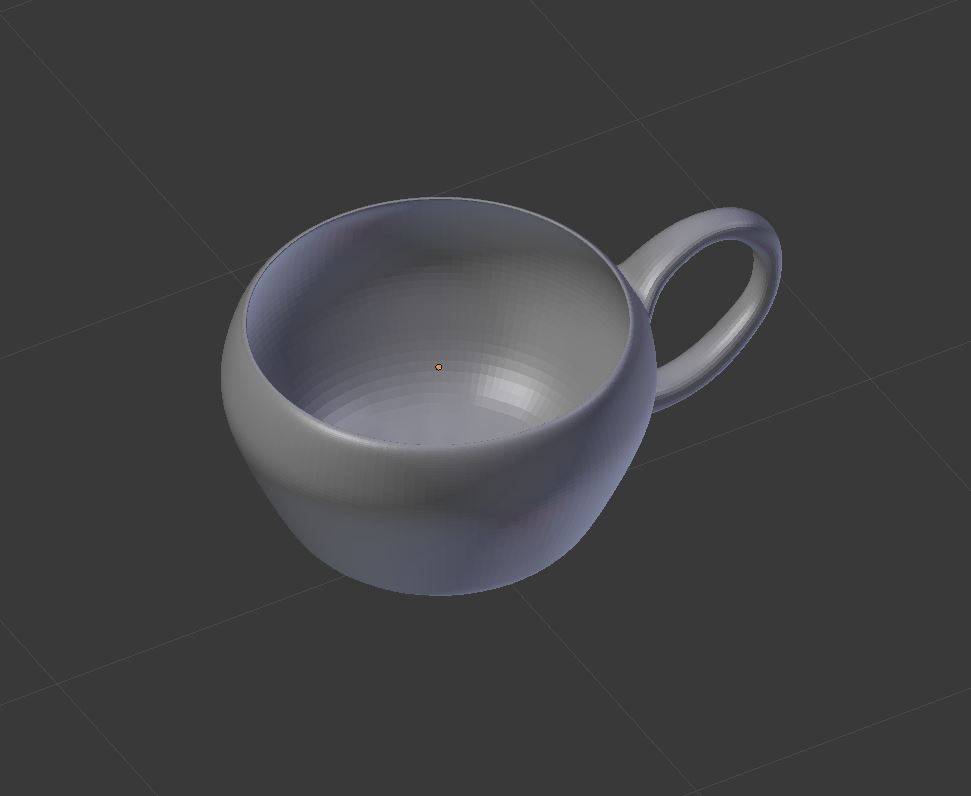

I then made a teacup, This only took one major attempt as I was able to use the same tutorial for the teapot and learn from the mistakes I made there too.


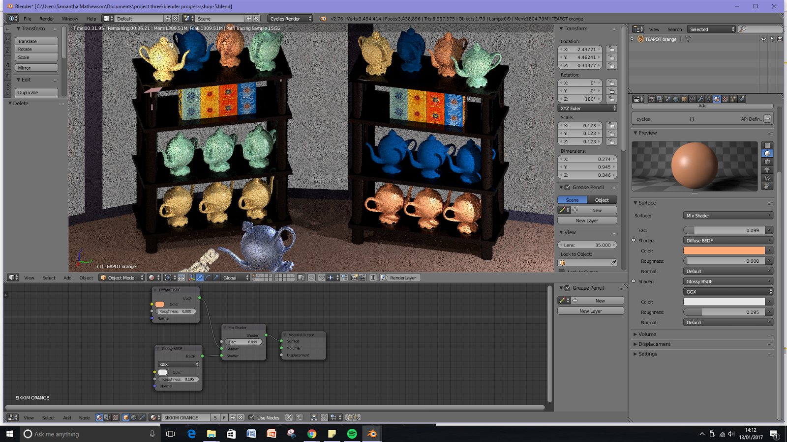
I applied my tea box design onto a cube in blender to make the 3D visualisation.I then began to stack the shelves, showing off the unique qualities of the tea boxes that makes them stand out from most common tea shop displays I have come across.
I used an array to duplicate the boxes as this is meant to cut down on how big the file will be and how much memory would be used when i go to render it all.
edit: stacking the shelves took a lot longer than I had originally intended. I spent too much time focusing on details that, now completed, are relatively minor with the scene combined as a whole.


Above are the four tea types. All faces on the tea boxes are designed to join together to show a repeating pattern, such as the teapots on two boxes, one half side by side joining up to make one.

This was the initial layout of the shop space. The display counter need to be made and included. The counter for the staff has lighting on the base. The shelves on the walls is designed to be tall and overwhelming, requiring a chair or stool to reach the top most boxes.

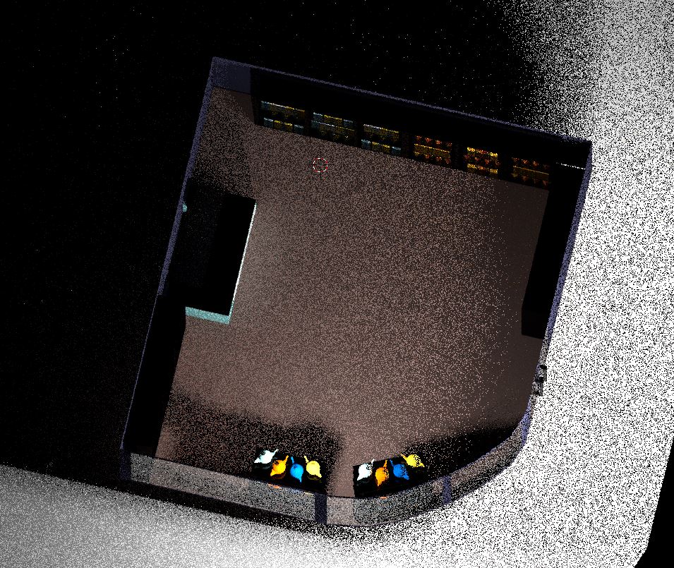


Above shows the different angles of the scene

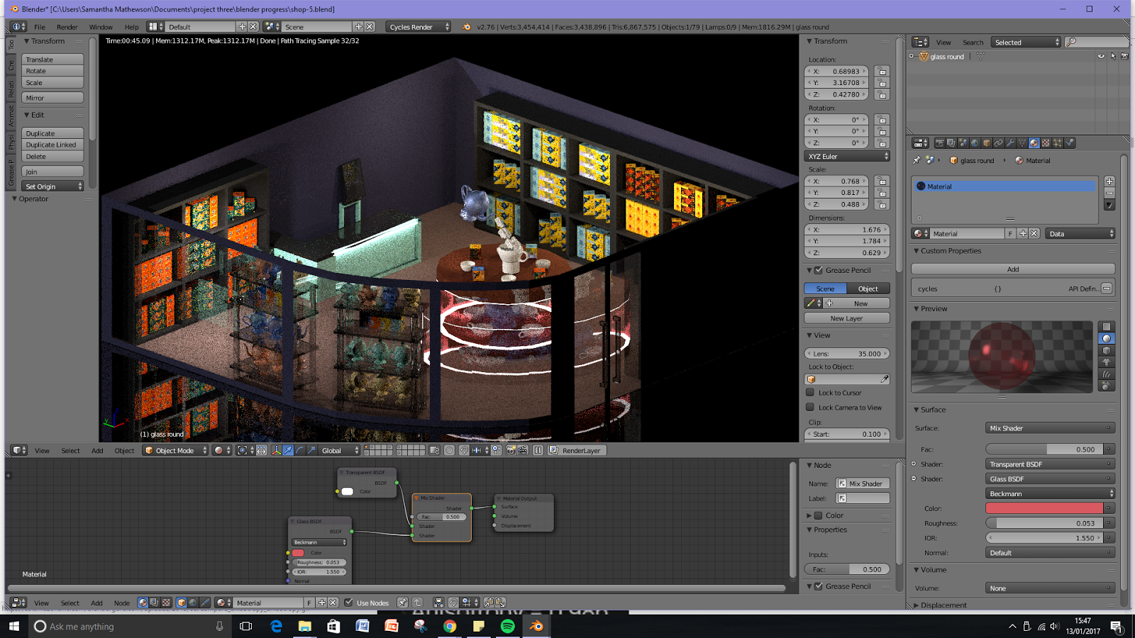
Using the teapot model I made earlier I decided to include it into the display that would fill the middle of the shop. I made the outer edge transparent (meant to be glass) and so you could see inside I applied the same technique I used to make the cashiers desk have lighting on the base;
This involved making part of the model have an emission setting applied to it so it would appear to give off light like LEDs would do.


To apply the branding further I made it appear as if the teapot was pouring out the words SIP. I would have liked to have made it look like loose tea was being poured out but after looking up tutorials online I felt that given the short amount of time left (less than a week) I would not be capable of learning how to make sand particles with a realistic render and then figure out how to make the sand particles look like loose tea.
edit: I prefer having the words fall out the teapot now that a glass texture has been applied. If you were in the scene I believe the light would glisten off of them nicely and would catch your attention.
The link above is where I learnt about nodes and how they are used to apply textures to objects to make it more realistic. This was most useful when it came to making glass and glossy surfaces such as the counter top.


Screenshots showing the node settings I used for the shelving in front of the windows.


When I discovered the nodes with the tutor, I realised that there is still a lot about blender that I do not know. I thought I had basic but confident knowledge on how to use it but I know wonder how basic it really is. Part of my issue is not practicing or using it all of the time to be able to remember controls and short cut keys, I also struggle to pick up new skills if I don't have somebody around who can guide me or point out silly mistakes that might have happened, such as changing the point in which you can rotate your object or scale it to.
I had to
compromise with the textures for the floor and display counter. This was mostly
due to the fact that when I attempted the floor texture, I could not figure out
how to fix the UV map to make the image of wood look like wood. It had
fragmented and twisted making it even less realistic. I also decided that if I
started applying more realistic textures to the floor and counter, I would have
to do the same for the whole scene too, so I had to compromise and just colour
the wooden objects brown instead because otherwise the style would not be
consistent.
With the nodes I was able to apply a glass
texture which was much more aesthetically pleasing and realistic that before.
The lighting, although I am pleased with
the outcome, it still needs more work and time adding to it.
No comments:
Post a Comment