Wednesday 18 January 2017

Finals


London and New York Fashion Week Posters


The two book covers I made for Hans Christian Andersens fairy tale, The Snow Queen/
The altered and final version of my promotional GIF. The "coming soon" text does not pause because it is expected and holds your attention incase you miss it too, thus making you watch it again.


6 images showing my 3D visualisation I made in blender


Brief 3 - Rendered 3D Visualisatiions

Below is a list of weblinks that I have looked at whilst making this virtual  scene. Most of these are tutorials and guides on blender however the first few links are those that I read before I had even starting making the scene.

  1. http://money.howstuffworks.com/product-placement1.htm - product placement in a shop
  2. http://firmology.com/2013/10/01/organize-your-retail-spaces-to-encourage-buying/ - organising the retail space
  3. http://fitsmallbusiness.com/planning-your-store-layout/ - store layout
  4. http://www.archdaily.com/590090/t2-shoreditch-landini-associates/54bf26f4e58ece56370001bc-floor-plan - looking at the T2 brand
    T2 Floor Plan
  5. http://www.knstrct.com/interior-design-blog/2015/4/2/small-tea-a-lounge-experience-for-tea-lovers-designed-by-osmose -  a boutique tea shop
  6. https://www.blender.org/manual/render/cycles/lamps.html - different types of lamps in blender
  7. https://www.blendernation.com/2011/08/24/tutorial-how-to-add-lights-to-an-interior-scene-in-blender-cycles/ - how to add lighting
  8. https://www.youtube.com/watch?v=643CAA5Zh_8 - how to make glass
  9. https://www.blender.org/manual/editors/uv_image/uv_editing/applying_image.html - applying textures
  10. https://www.youtube.com/watch?v=aC1_m0VdKIY - exporting from blender to unreal engine
  11. https://www.blender.org/manual/modeling/meshes/selecting/advanced.html - advanced tools in blender
  12. http://www.instructables.com/id/Beginners-Guide-to-Blender/?ALLSTEPS - beginners guide to blender. useful when I had forgotten many of the functions I needed to actual begin modelling
  13. https://cgcookie.com/course/mesh-modeling-fundamentals/ - fundamentals of mesh modelling
  14. http://www.instructables.com/id/How-to-use-text-in-blender/?ALLSTEPS - how to apply text into the scene
  15. https://www.youtube.com/watch?v=W07H7xeUnGE -  the secrets to realistic texturing in blender. this video taught me a lot about how to achieve realistic textures however I have not yet attempted to follow this tutorial


MISTAKE-It isn't until I get to render scene 6 where I realise the tea boxes on the display counter aren't touching the counter top. Now it will be a test of efficiency and time to see how many scenes I can render with the boxes in the right place.


the rest of the rendered images below do not have the floating tea boxes


Brief 3 - Arch Viz

Architectural Visualisations (Arch Viz)


Blender Guru has been a source of inspiration and guidance with tutorials regarding blender and 3d visualisations.

This video was useful to me because it gave me an insight to some of the terminology that is used as well as showing me why having a skill in architectural rending is useful.

Some of the questions that he covered included;

What’s the practical uses of architectural rendering in the real world?

what are the principles of it?

Why should you care?

Is formal education necessary?

Going through the video I made notes of what I thought would be most beneficial to me.

What’s the practical uses of architectural rendering in the real world?

1.       To visualise an architect’s plan for investors.

2.       To visualise a property for buyers e.g. real estate trying to sell you an apartment not built yet so they show you the living room ect.

3.       To make pretty pictures- not so much practical wold, a lot of people will have about a week for the top two reasons. Desirable skill for employees. Makes portfolio look good- shows off your capabilities.


Why should you care?

1.       It is a strong industry and so always in demand – lots of job availabilities.

2.       Skills apply to other industries such as animation or working for a studio. Composition, texturing, post processing, lighting, 3d artistry

3.       Looks great in portfolio

4.       Attractive skill to have

Is formal education necessary?
No, Michael Simmons, arch viz artist for 3 years, says it helps in the sense of lingo and work flow process but there are well renowned architectural artists; such as Alex Rom, Bertrand Bertroi, who have had no formal education.

Architectural rendering workflow:


Fundamental pyramid:


Designing architecture: foundation, understand the design of it

Understand the art of buildings:

1.       design for a purpose

2.       beauty will come through as its purity of its function

3.       shape the rooms for their intended purpose e.g. put in furniture first build the walls around that, where do people sit ect

4.       Never add pointless “doodads”/ decoration/bevels on the outside of the building, must be able to have two reasons as to why you made the choice.

5.       Should share a connection with nature or the surrounding it e.g. if in city. Frank Lloyd write, the best architecture doesn’t make a landscape worse but it improves it and makes it more interesting.

Interior design: designing an appealing room.
5 tips:

1.       Design for a specific individual. Is it a family, one person, gender, interests, age? Basically, come up with a story book for their life.

2.       Ensure each element has harmony i.e. if its modern, keep everything modern. The beauty comes from all the elements together.

3.       Use predominantly natural colours e.g. black white greys and browns. Use colours sparingly. They should make up like 80% of the image.

4.       Balance the room with equal weight, e.g. don’t have super heavy couch on one side and then small coffee table on the other. Or all furniture ect on floor and nothing on the ceiling.

5.       Keep colours and patterns to a minimum, but don’t use too few because then it will be a dry scene and people will find it dull.

Lighting: designing appealing lighting

1.       four categories(purposes): accent, task, decorative and ambient.

1.1.    accent (halogen downlights over seating or bedding area. Areas of visual interest)

1.2.    task (e.g. reading or meal prepping a kitchen. These lights should be placed between eyeline and where the person’s hands would be, not over the top of their heads.)

1.3.    decorative (e.g. hexagonal lights, create the illusion that this lighting is lighting the room but It should not be)

1.4.    ambient (bounced off the ceiling to give the warm soft feeling of the room. Torchiers, wall sconces, or a cove might be made with LEDs around the edge of this to bounce into and create same effect)

2.       Don’t light up everything, still needs shadows

3.       Use shadows to cast interesting shapes and patterns. E.g. blue light above plants/trees shines light against a wall.

4.       Humans most comfortable around 2800*C kelvin, so like a candle, reddish, like fire. People hate cold florescent lighting such as those in offices.

5.       Great exterior lighting during the “blue hour” as lights can be turned on and you can see inside and outside.

Camera, where you place the camera to get an appealing render

Capturing the building or room in an appealing way

1.       Three styles: documentative (sterile, accurate representation), artistic (create an emotional image), abstract (e.g. capture a shadow under the stairs ect)

2.       35mm is most comfortable to the human eye which is the default in blender. Don’t go under 30mm.

3.       Every image needs negative space to “breathe” e.g. white or low interest. Bare wall, bare floor.

4.       Focus on telling a story (mostly relevant for the artistic representational shots)

5.       Read up on photography to find tips on capturing decent scenes.

Post processing is finishing touches to an image (it isn’t always necessary but often used when on a tight deadline and need to touch up something)

1.       Have reason for it. Don’t copy people.

2.       Mimic a camera, less distortion, lens flare, blow out the windows ect that would happen naturally with a camera.

3.       Use colour grading for changing a mood, but can often be achieved within lighting

4.       Don’t blindly copy other

5.       It is not always necessary

After watching the video and making notes I went and looked up some of the people that were mentioned such as Alex Roman and Bertrand Bertroi.

Bertrand Bertroi:

http://www.ronenbekerman.com/3d-artist-interview-bertrand-benoit/


Please tell us a little bit about yourself and how you initially became interested in Architectural Visualization? Do you have any formal training in this field?
Unlike many colleagues in the field, I wasn’'t trained as an architect but came to Visualization via photography about four years ago. I was attracted to CG as a means to push the boundaries I was encountering in architectural photography. The ability to create photorealistic renders of virtual scenes on off-the-shelf hardware was what initially fired my interest.

On what types of projects you like to work best?
I like to work on promotion and marketing material since these tend to stress the artistic (rather than the informational) qualities of an image most and give the artist the biggest amount of freedom. If I were to be completely honest, though, I would say I much prefer to work on personal projects, where freedom is absolute. I almost never publish images of paid-for projects even when I'm allowed to.

Are you a post work or pure render type of artist? (Granted, post work is always needed, but how much remains for you to do in post)
I'm a strong believer in doing as much as possible in 3D. I would never paint additional texture layers in 2d on finished renders, for instance. I do this in 3ds Max when needed by applying texture layers after texture layers using different UV sets. I also would rather model my surroundings and entourage than compositing them. This is not because I think the outcome looks better that way (it frequently doesn'’t), but I want to have maximum freedom in placing my camera once a scene is fully modelled and shaded.
I also like to know that I could animate my scene if I wanted to and not be restricted to stills. Of course, post-work is always a must when it comes to colour correction and some lens effects. You can improve a good render enormously with sensible post-work, but I think you can never rescue a mediocre render.

What other artists inspire you?
All the usual suspects: Peter Guthrie whom I'’ve mentioned, Alex Roman, Viktor Fretyan, the entire Berlin team at Pure and all the others I forget. I also keep a close eye on non-Archviz CG stuff and am a great fan of people like Stefan Morrell.

What would you suggest to someone wanting to become part of this industry? What are the essential skills to focus on when one starts?
I would recommend beginners keep a close eye on competitors’ work and try to learn as much as they can from them – both technically and artistically – while vying to make their work stand out from the crowd and trying to get noticed. Having said that, I think one thing that is hugely important is to make sure you don't restrict yourself to other people's CG as your sole source of inspiration. Look at photographs, look around you and try to think of how you would translate what you see into CG. This is probably the best way to push your limits and improve your work.

Alex roman:
http://www.evermotion.org/articles/show/8268/alex-roman-i-love-architecture


Alex Roman bio:

Born Jorge Seva in 1979, “Alex Roman” is an artistic alias for publishing commercial work. He has been working for several companies since until he raised a brand new company by hiself: “The Third & The Seventh S.L.” After that, he took a sabbatical year for to work on an “already-built work” visualization series, which are now stitched together into a short animated piece: “The Third & The Seventh”. He won a Cannes Film Craft Gold Lion in the year 2011 for the Silestone brand commercial: “Above everything else” As well as Prix Ars Electronica – Computer Animation / Film / VFX prize in the same year for “T&S” shortfilm. In the year 2011 he also supervised more than 20 vfx shots for the acclaimed David Fincher’s feature “The Girl with the Dragon Tattoo”. Alex’s work has been featured in Motionographer, FilmPro magazine, Filmnosis and FXGuide among others. He has just released the self-publish book “From Bits To The Lens” that covers both artistic and technical aspects of his “T&S” shortfilm.


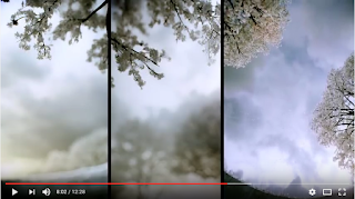
The Third and Seventh. This video showing the capabilities of CGI and 3d rendering.

I picked the cherry blossom scenes to screenshot because I find them beautiful and mesmerising in reality and onscreen virtually.


Alex Roman said that he started "The Third and the Seventh" company to express his personal view of what architecture meant to him. I have summarised a few questions that Roman was asked which I have found most useful.


Q - What is most time consuming part of making a great VIZ for you?
A - Pre-production and modelling. Lighting is becoming an easier task with modern render engines. Postproduction; managing layers, managing final colour and the not-so-3D elements makes the difference in my honest opinion and need a lot of time too. 


Q- Do you use ready-made models or some automation tools in your works? (forestPacks, OnyxTree, scripts, assets libraries)? 
A – Yes, An artist should focus on other kind of tasks than modelling in my opinion.


Q - What kind of knowledge - besides knowledge of tools like 3d software - helps in your opinion in becoming the great cg artist?
A - CG and painting share exactly the same philosophy: you must light and colour from scratch in a white canvas. Hence is essential to know how shapes, colour and light works in the real world.


What did I take away from Roman and Bertroi?

That I should not be discouraged that I have no formal education in architecture but I should learn more about lighting and how to set the scene using colour and light. I would say that unless I am creating stills, postproduction may not become a huge factor in my work, I prefer Bertroi's perspective of being able to have the freedom to animate and create stills of the same scene.

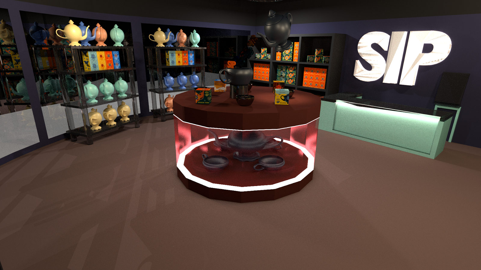
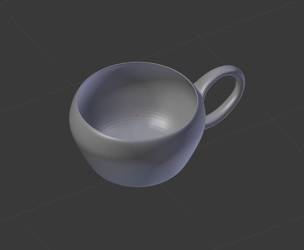
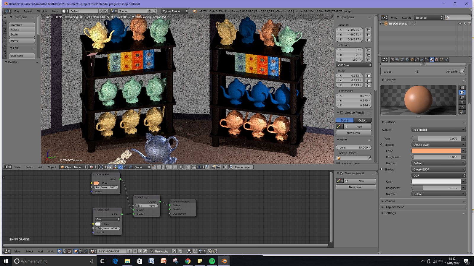
In my own project I know that I spent a lot of my time creating the models for my scene. Looking back at it now, I could have saved time by using pre-made models. This could have allowed more time to work on learning more about lighting, texturing and setting the scene and shall be something I keep in mind for any future digital visualisations that I do.

I will continue to look up different Arch Viz creations, as well as discover more about some of the people that they both mentioned, such as Viktor Fretyan and Peter Guthrie.

Saturday 14 January 2017

Brief 3 - 3D Visualisation

Brief 3

aim: to visualise a space using blender to demonstrate an understanding of brand and identity.

I chose blender because i am more familiar with it. I had originally wanted to render the scene within Unreal Engine however, given the short amount of time i had allocated myself for this project, I had to be conscious of my own skills.

This brief came around after the college trip to London where I discovered a tea nrand shop called T2. on the isle of man we do not have dedicated tea shops so whenever I am in the UK I enjoy visiting them. To discover T2 was a highlight of the trip and the experience there was a huge influence on this project. 


The shape of the space for example was based around T2, mostly with the layout of the center display and the curvature of the entrance and windows on the wall, as you can see at the start of my model in blender.


Research:

First person experience from London trip, as well as in general stores such as Tesco and co-op, and when I was in Berlin last year with college too. I used pinterest and google image searches to look up examples of tea shops and displays as well.


Above shows examples of tea displays when I quickly went into a Fortnum and Mason shop in London.


This scene is more rustic, the neatly organised boxes on the back shelf are appealing though with the greenery and wood making you feel more in tune with nature which is often lost in today's world of busy cities and the internet.


The clean white edges are visually appealing, they give off a sense of serenity, are neatly organised and have lots of light in them. 


A stark difference from the previous examples with the use of colour being an important factor to get the audiences attention; although it is still in keeping with the clean edges of the shelving and organisation of the products.


I did some research into the T2 brand and discovered they were an international brand. The examples above were from their store in Brisbane. 

The Great Wall of Tea at Tea Co.
This one particularly got my attention because although the image isn't very clear each circle is the top of a tea caddie (that is magnetically stuck on the wall) a birds eye view of the type of tea brewed inside a cup. The ingenious design of this means you know if it goes with milk or not but also the caddies can be moved around as they aren't permanently stuck to the wall.

East India Company Soho
I chose this for the shiny ceiling which makes the space more unusual and for the chests being used as counters for displays.

This image inspired me to come up with thumbnail designs in my sketchbook for what my displays could include; such as hanging tea cups, teapots, falling tea (realistically would be the equivalent of glass or resign shaped to look like water/tea) or loose tea falling a bit like sand or coffee beans. I could also have teabags that are larger than life hanging up or piled up in different ways.

I chose this image because of the lighting which, although there are many lamps, is gentle and diffuse. I also chose this for the poster on how to make a perfect brew. This could be an idea on how to fill the wall space in the tea shop or even have little stands on counters with it on.

The Twinings strand idea to pick out individual tea bags is appealing to me however I don't think this idea would be overly beneficial to me for this brief as I think I would waste too much time trying to layout the teabags.


I first started making the shape of the space. Having no measurements to go by, I knew from the start that this model would not be accurate. If I had this as a commission or was employed to do this I imagine parameters would be set out so I knew from the start the size and shape of the space including doors and windows. The two screen shots show the tutorial I found online that guided me enough to shape the corner of the shop as I did not have any knowledge as to how to do this. 

edit: it has been over a year since I properly used blender so I spent a lot of time throughout this project looking up how to do things as I had forgotten or did not know how.


I was able to follow a tutorial on making a teapot and this was my first attempt before adding a modifier.


Above is the second attempt with a modifier applied. The model didn't render correctly around the joint of the spout to the body of the pot. I didn't know why until I was able to get help, as it turned out I had double vertices on the model which created a flat part on the body of the pot too. Some of the points had become twisted on the joint that didn't work. I had attempted to reorganise them one by one but I couldn't figure out what had gone where so I ended up remaking the model for a third time as I thought it would be quicker. (I still believe it was the right choice)


I then made a teacup, This only took one major attempt as I was able to use the same tutorial for the teapot and learn from the mistakes I made there too.


I applied my tea box design onto a cube in blender to make the 3D visualisation.I then began to stack the shelves, showing off the unique qualities of the tea boxes that makes them stand out from most common tea shop displays I have come across.

I used an array to duplicate the boxes as this is meant to cut down on how big the file will be and how much memory would be used when i go to render it all.

edit: stacking the shelves took a lot longer than I had originally intended. I spent too much time focusing on details that, now completed, are relatively minor with the scene combined as a whole.


Above are the four tea types. All faces on the tea boxes are designed to join together to show a repeating pattern, such as the teapots on two boxes, one half side by side joining up to make one.


This was the initial layout of the shop space. The display counter need to be made and included. The counter for the staff has lighting on the base. The shelves on the walls is designed to be tall and overwhelming, requiring a chair or stool to reach the top most boxes.


Above shows the different angles of the scene

Using the teapot model I made earlier I decided to include it into the display that would fill the middle of the shop. I made the outer edge transparent (meant to be glass) and so you could see inside I applied the same technique I used to make the cashiers desk have lighting on the base;
This involved making part of the model have an emission setting applied to it so it would appear to give off light like LEDs would do.


 To apply the branding further I made it appear as if the teapot was pouring out the words SIP. I would have liked to have made it look like loose tea was being poured out but after looking up tutorials online I felt that given the short amount of time left (less than a week) I would not be capable of learning how to make sand particles with a realistic render and then figure out how to make the sand particles look like loose tea.

edit: I prefer having the words fall out the teapot now that a glass texture has been applied. If you were in the scene I believe the light would glisten off of them nicely and would catch your attention.


The link above is where I learnt about nodes and how they are used to apply textures to objects to make it more realistic. This was most useful when it came to making glass and glossy surfaces such as the counter top. 


The renders of these hadn't fully completed but i was focusing here on showing how I had used nodes to apply the texture to the teapots.


Screenshots showing the node settings I used for the shelving in front of the windows.


For the display cabinet in the middle of the shop floor.

I wanted to add something to the wall where the checkout counter is. I decided to add the brand name as I currently was running out of time to add labels and signs into the space.


Adding in the brand sign behind the counter. I made it have a light behind it because I thought it was an efficient way of lighting the scene too.

This screen shot shows one of the lights I was positioning.

When I discovered the nodes with the tutor, I realised that there is still a lot about blender that I do not know. I thought I had basic but confident knowledge on how to use it but I know wonder how basic it really is. Part of my issue is not practicing or using it all of the time to be able to remember controls and short cut keys, I also struggle to pick up new skills if I don't have somebody around who can guide me or point out silly mistakes that might have happened, such as changing the point in which you can rotate your object or scale it to. 

I had to compromise with the textures for the floor and display counter. This was mostly due to the fact that when I attempted the floor texture, I could not figure out how to fix the UV map to make the image of wood look like wood. It had fragmented and twisted making it even less realistic. I also decided that if I started applying more realistic textures to the floor and counter, I would have to do the same for the whole scene too, so I had to compromise and just colour the wooden objects brown instead because otherwise the style would not be consistent.

With the nodes I was able to apply a glass texture which was much more aesthetically pleasing and realistic that before.

The lighting, although I am pleased with the outcome, it still needs more work and time adding to it.